

Design A App For Restaurant Table Booking
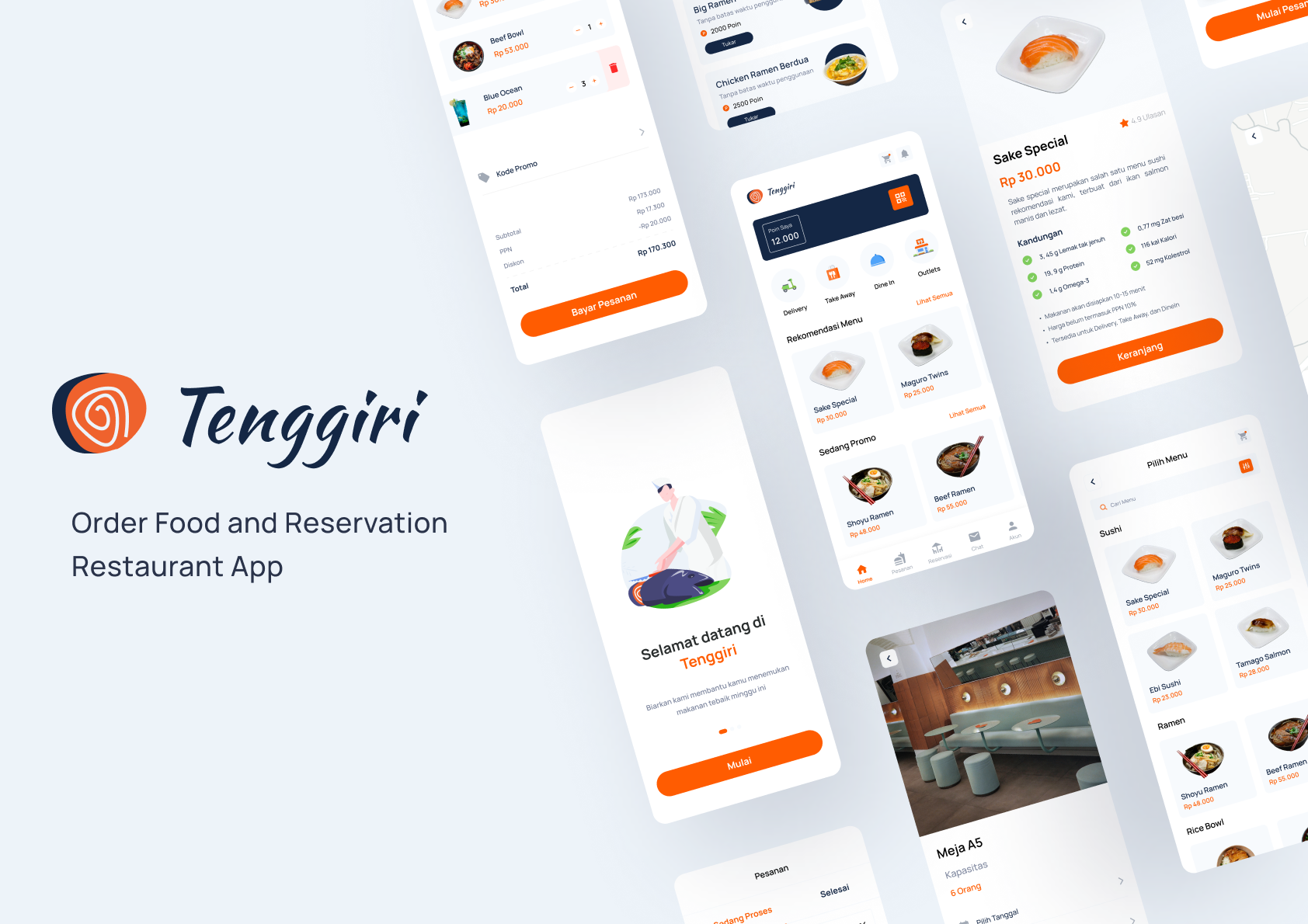
UX Case Study Tenggiri App (Order Food and Reservation Restaurant App)
![]()
Background
When someone will go to a restaurant sometimes feel disappointed when the queue is long or the restaurant table is full. That often happens when there is a big promo or interesting promo at the restaurant. Many customers are tired of waiting in long queues and feel disappointed with it. So when customers see such a long queue, they are immediately reluctant to come and will move to another restaurant.
This kind of thing often happens in a crowded restaurant with online drivers or online food ordering. Almost all restaurants, when there is a big promo, must be very crowded because many customers are interested until the restaurant is full and exceeds capacity. This shouldn't happen, especially during a pandemic.
The Tenggiri application is a restaurant ordering application, the general purpose of this application is to make it easier for people when ordering food at a restaurant.
The main purpose of this application is that users can make table reservations so they don't have to wait long to order and can see the number of customers in the restaurant. Besides that, it also provides several options for ordering food to make it easier for users.
Methods
I use the method because the Design Thinking method is very practical to use in solving a complex problem by finding information about the human needs involved.
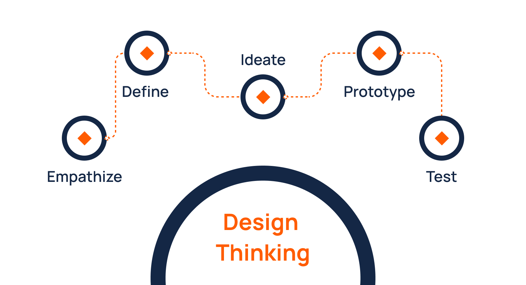
First Phase — Empathize
I started in the Empathize Phase to identify issues and gain a deeper understanding of potential users. I use 3 stages in this phase. The goal is that I can answer the challenges they face.
- Share online surveys via google forms
- In-depth interview
- Competitive Analysis
From the three data above, I will validate the problems experienced by potential users and gain insight from potential users in designing applications.
Online Survey
From the online survey, I got 28 respondents from students to employees. I want to know and validate the needs of people in making reservations at a restaurant. For more detailed results, you could check this link.
From the result I got, I can conclude that only some of my respondents have created a restaurant table reservation by contacting the restaurant directly through their social media. But sometimes the response from the restaurant seems long.
So, they immediately went to the restaurant's location without making a reservation and were annoyed that the queue was long. The table was full and finally looked for another restaurant. This means that many people are aware of this condition, but they have waited a long time for a response from the restaurant when making a table reservation or maybe they don't understand how to reserve a restaurant table.
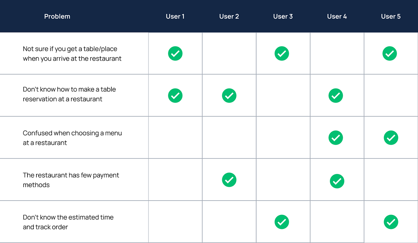
In-Depth Interview
After getting an understanding of potential users through an online survey, I interviewed 5 potential users from the age range 18–25 who often experience problems in serving a restaurant. I'd like to know their behavior when they run into those problems by putting together the problems potential users are experienced in the form of validated issues.
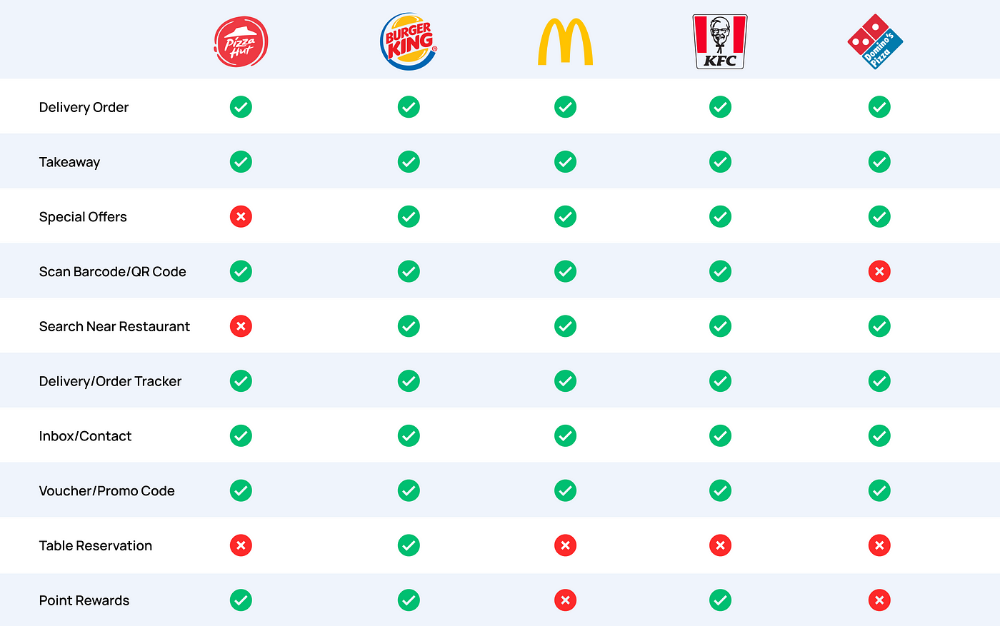
Competitive Analysis
After validating the user's problem, I then conducted a competitive analysis with a desk research approach.
Second Phase — Define
I continued on the define phase after doing the empathy phase. Where in this phase I want to determine our target users based on the behavior I found during the In-depth Interview and identify the pattern of problems I found from the previous phase.
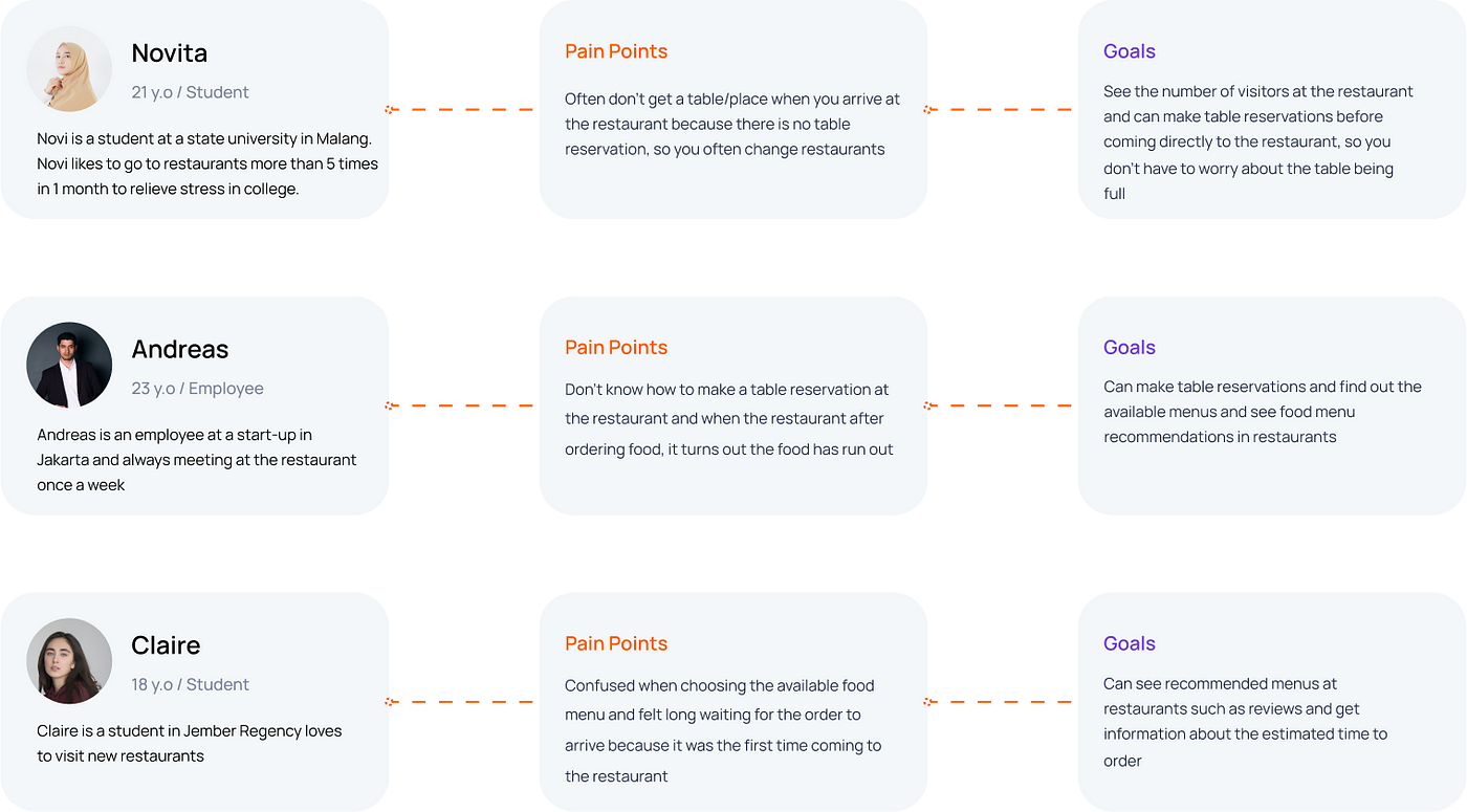
User Persona
From the results of our previous interview, I gathered some of the behaviors of the 3 users, pain points, and perceived goals of potential users, I began to categorize them into three different personas:
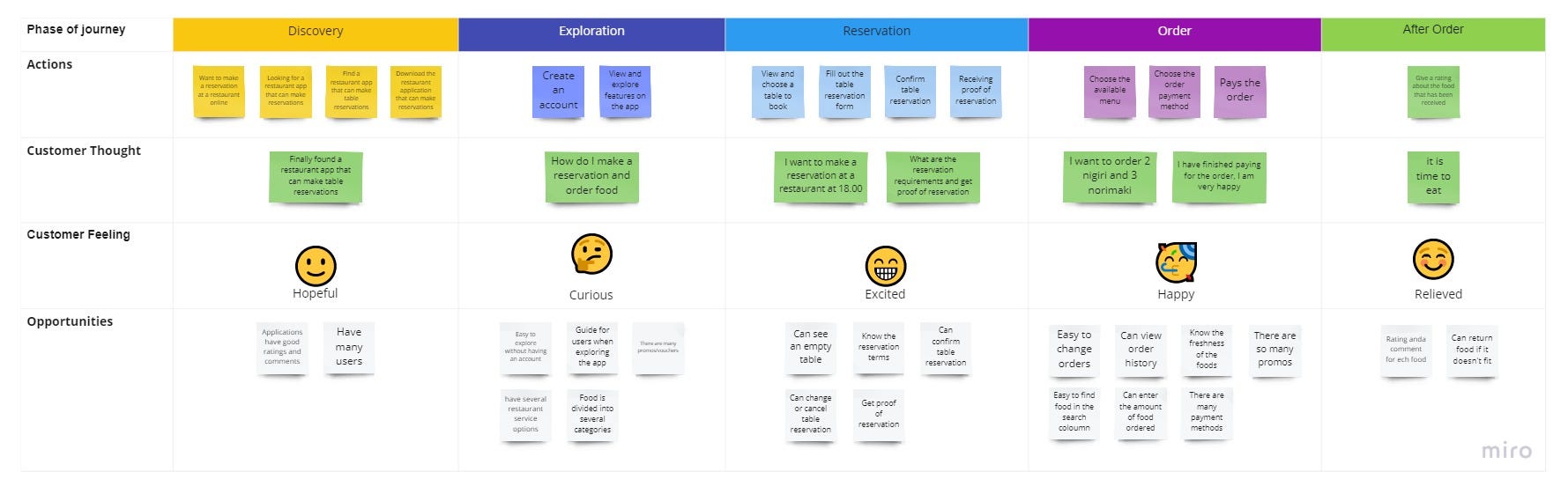
User Journey Map
After creating the persona, I created a user journey map to tackle the problem while considering the behavior I found.
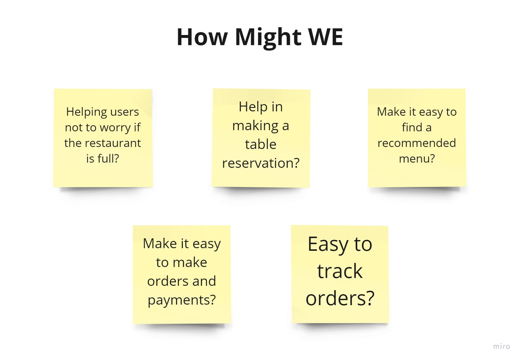
Then the idea generation is carried out to complete the design challenge using the How Might We (HMW) question method.
Third Phase — Ideate
I continued the ideate phase to find ideas that can be used to overcome these problems. This phase requires several points of view to produce a solution. Some of the ideas that have been collected will be evaluated to find the best ideas.
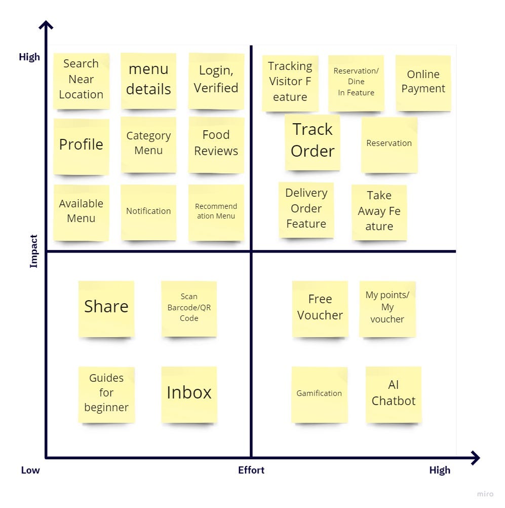
Prioritization Matrix
From the user journey map, to find effective and efficient products. I plotted it into the impact-effort matrix.
User Flow
I created a user flow of an application that will be designed to show how a user performs a task in the application.
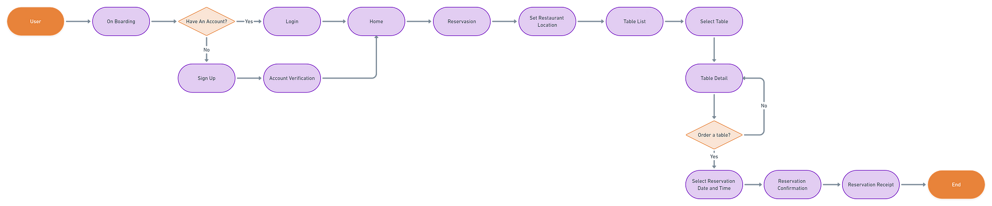
Reservation Feature
Low Fidelity
To simplify and save time in the design process, I created a wireframe to first get the structure of the created user interface.
![]()
Logo & Branding
Yup!! I gave a name to the application that I created. You can call it Tenggiri .
I use the color orange because this color is enough to describe sushi, besides in Japan the color orange has the meaning of happiness. Therefore, I want Tenggiri to be a source of happiness for most people.
The meaning of the logo of a piece of fish represents one of the main ingredients in making Japanese Sushi. Because there are many types of fish, here I use one type of fish that is quite popular in sushi food, namely Tenggiri.
Design System
Before going to the hi-fi stage, I decided to organize a small design system for UI consistency. Apart from this, the design system has its advantages. Like saving designer time and developer.
Hi-Fi
At this Hi-Fi stage, I started implementing all the existing flows in the application into a visual form that is easy to understand so that users are not confused when running the application.
Fourth Phase — Prototype
In this phase, I create a prototype that will be tested by potential users regarding this application.
Onboarding Screen
I created an Onboarding screen to show how to use the application or the best features in the application. On Tenggiri I show advantages such as food ordering and available promos.
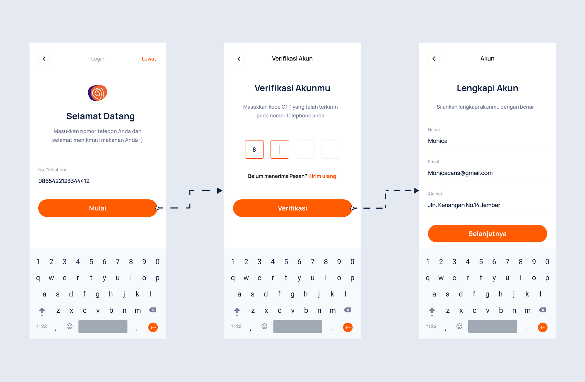
Login and Verified Account
The registration feature used in the Tenggiri application is very easy. Registration in this application only enters a phone number to register, then for the next process, namely account verification. After that, the user can complete the account form.
Reservation Feature
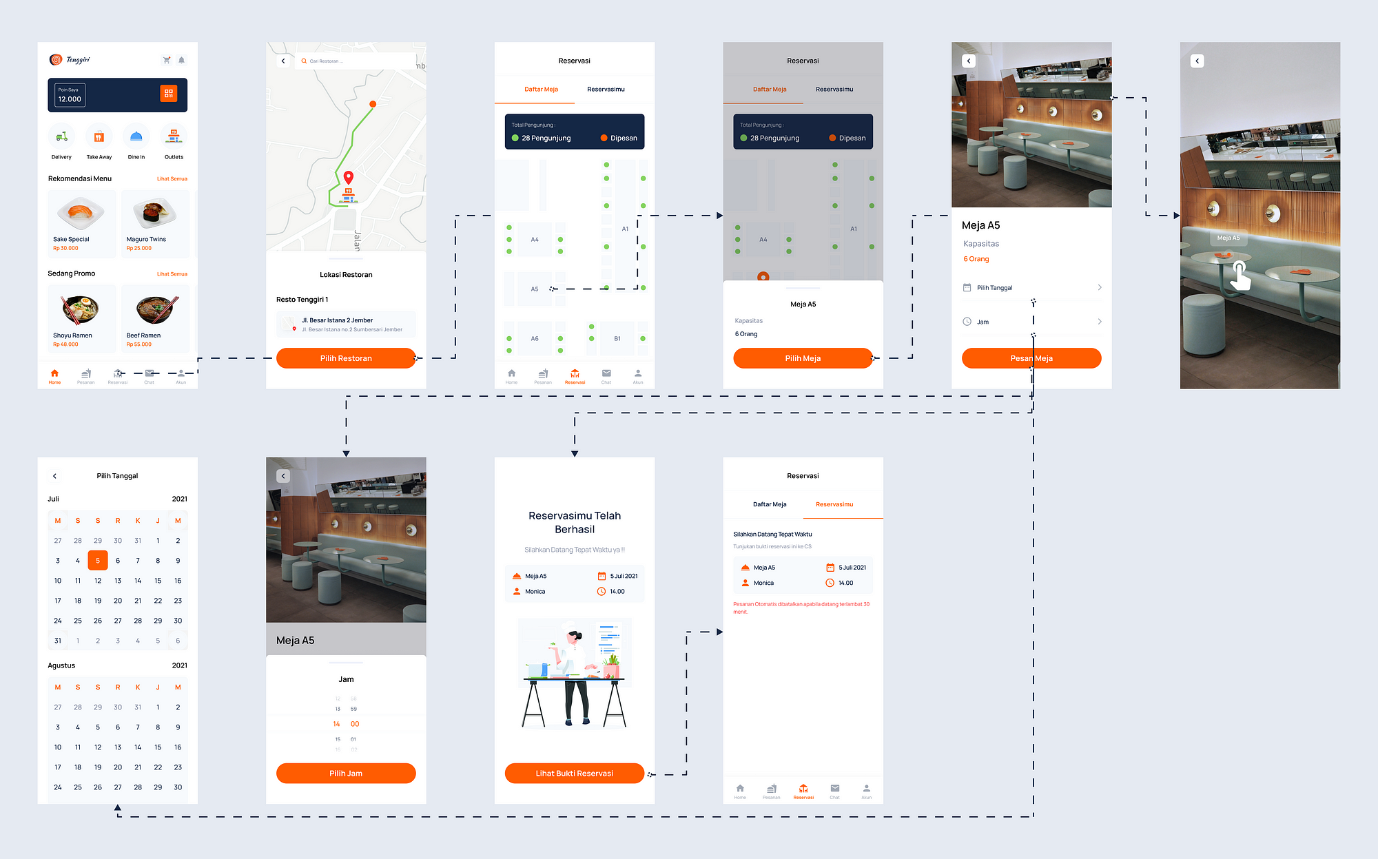
The user can make a reservation by setting the location of the restaurant to be visited, then the user can see a list of tables in the restaurant, and select a table by setting the reservation date and time. Furthermore, the user will receive proof of reservation which must be shown to customer service after arriving at the restaurant.
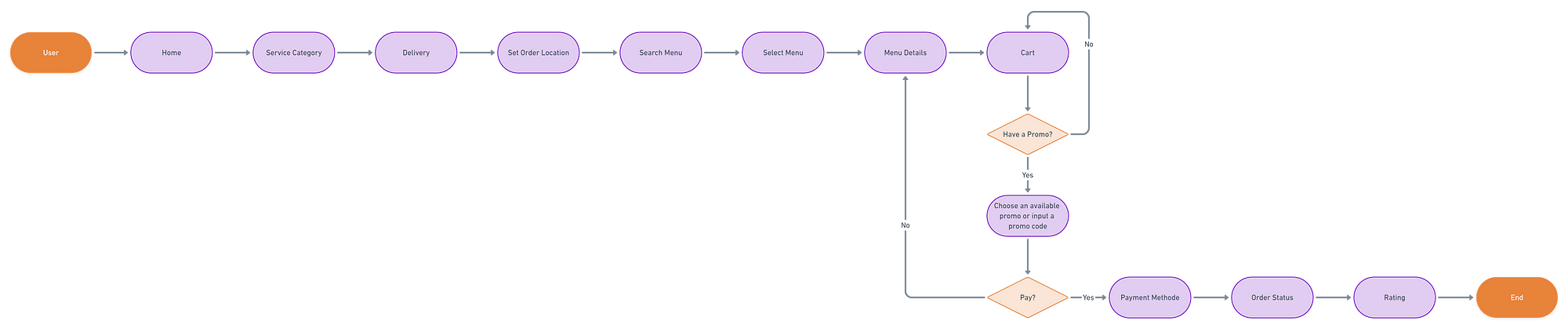
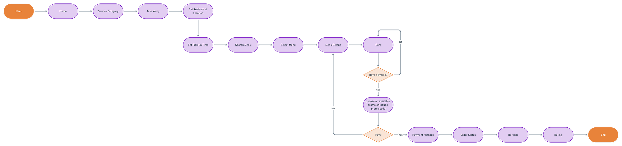
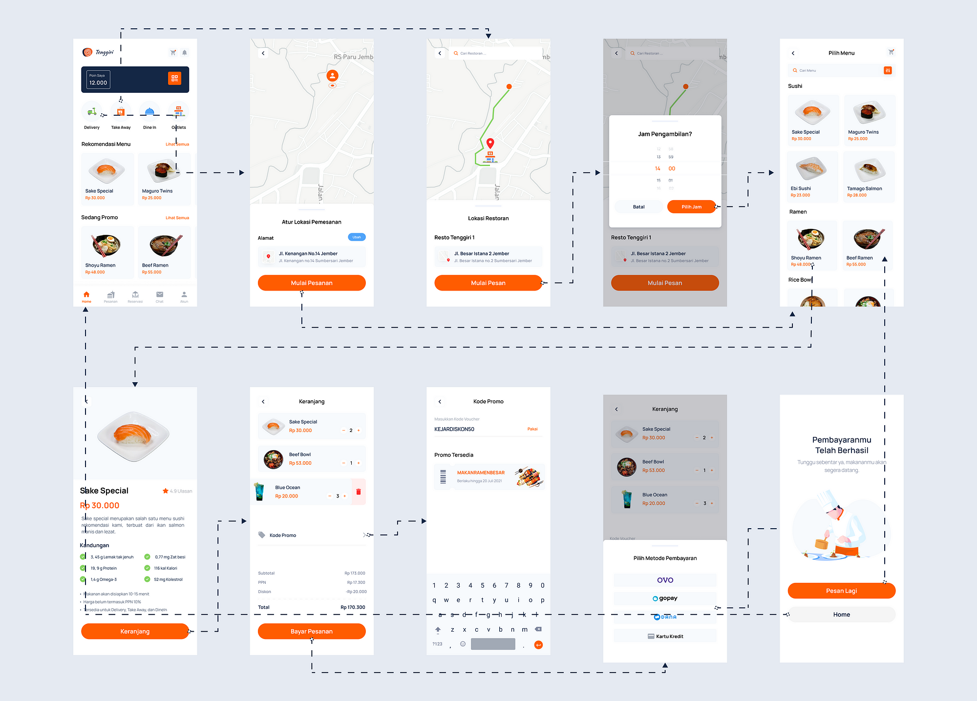
Delivery and Take Away Feature
The user can make a reservation by setting the location of the restaurant to be visited, then the user can see a list of tables in the restaurant, and select a table by setting the reservation date and time. Furthermore, the user will receive proof of reservation which must be shown to customer service after arriving at the restaurant.
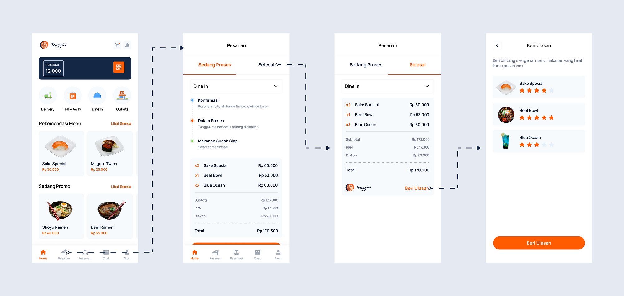
Order Status Feature
In this feature, users can track the status of their orders. After the user places an order, they will get proof of the order where the evidence will also show the status of the order, such as the order has been confirmed, the order is in process, the order is ready, etc. This feature was developed to help users know the estimated time of order, so users don't have to worry about their orders.
Five Phase — Test
In the last phase, testing is carried out which is useful to find out how the results of the interaction between the user and the prototype have been made. In addition, at this testing stage, you will get feedback. These feedback will help improve the performance of the product design. The test is done repeatedly in order to get maximum results.
Remote Usability Testing
I did remote usability testing because during the pandemic it was not possible to meet in person. although it's actually better to do it in person because I can't see users using the product in real life and I can't learning about user's behavior and preferences. For moderated testing, I did it with 4users. For unmoderated testing, I use maze tools and I get 12 users.
here are the results:

From the reports, I got it indicated users are not having many problems and completed the task, While I got some feedback on my design. I gathered user pain points for consideration and insights that are used in the iteration process.
Design Iteration
After I gathered user pain points, I analyze the findings to do a redesign. The following are the changes.
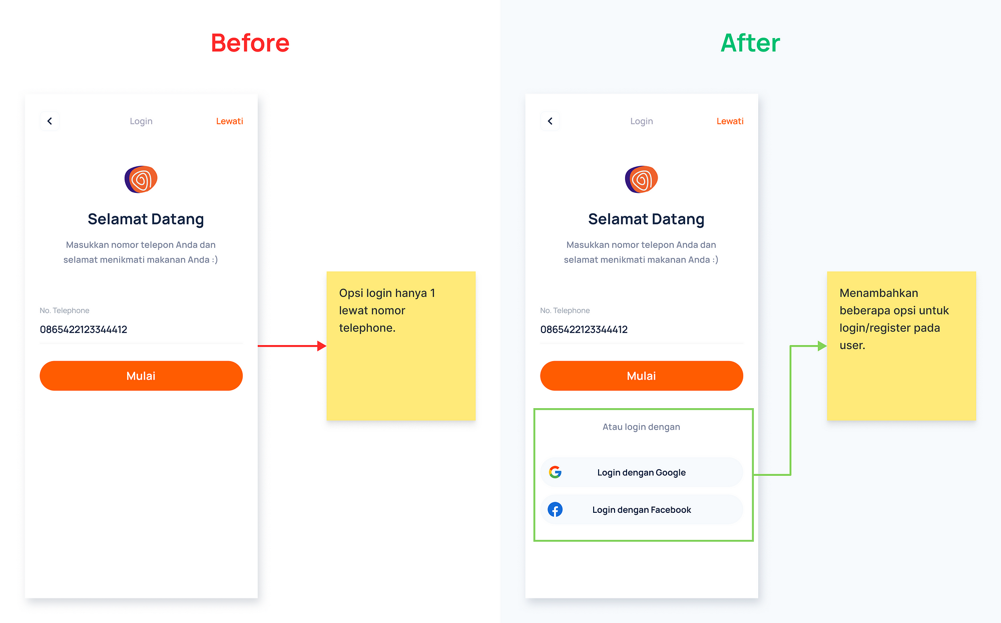
Login
Pain point:
The login option is only by telephone number.
Design solution:
Added several options to login/register on the user such as Google and Facebook.
Home
Pain points:
- My point information does not need to be bordered, because there is only 1 information and the number of points is too small
- There is no information that is ongoing / on progress when finished ordering.
Design solutions:
- Changed my point size font to be more visible to the user.
- Added on progress / ongoing features. So that the user can see the progress of each order.
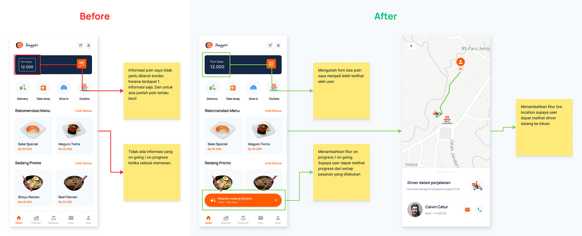
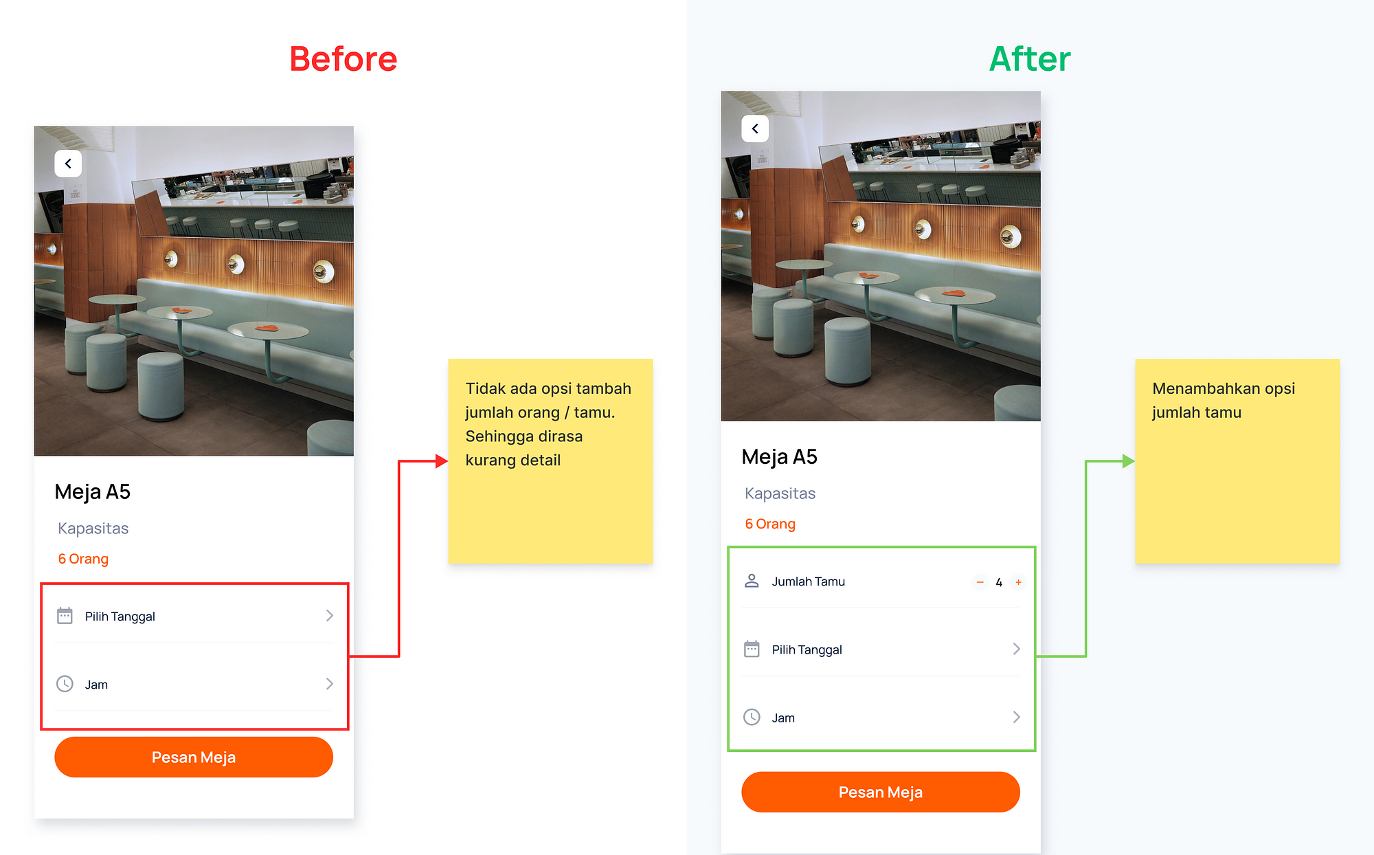
Table Detail
Pain point:
There is no option to increase the number of people/guests.
Design solution:
Added number of guests option.
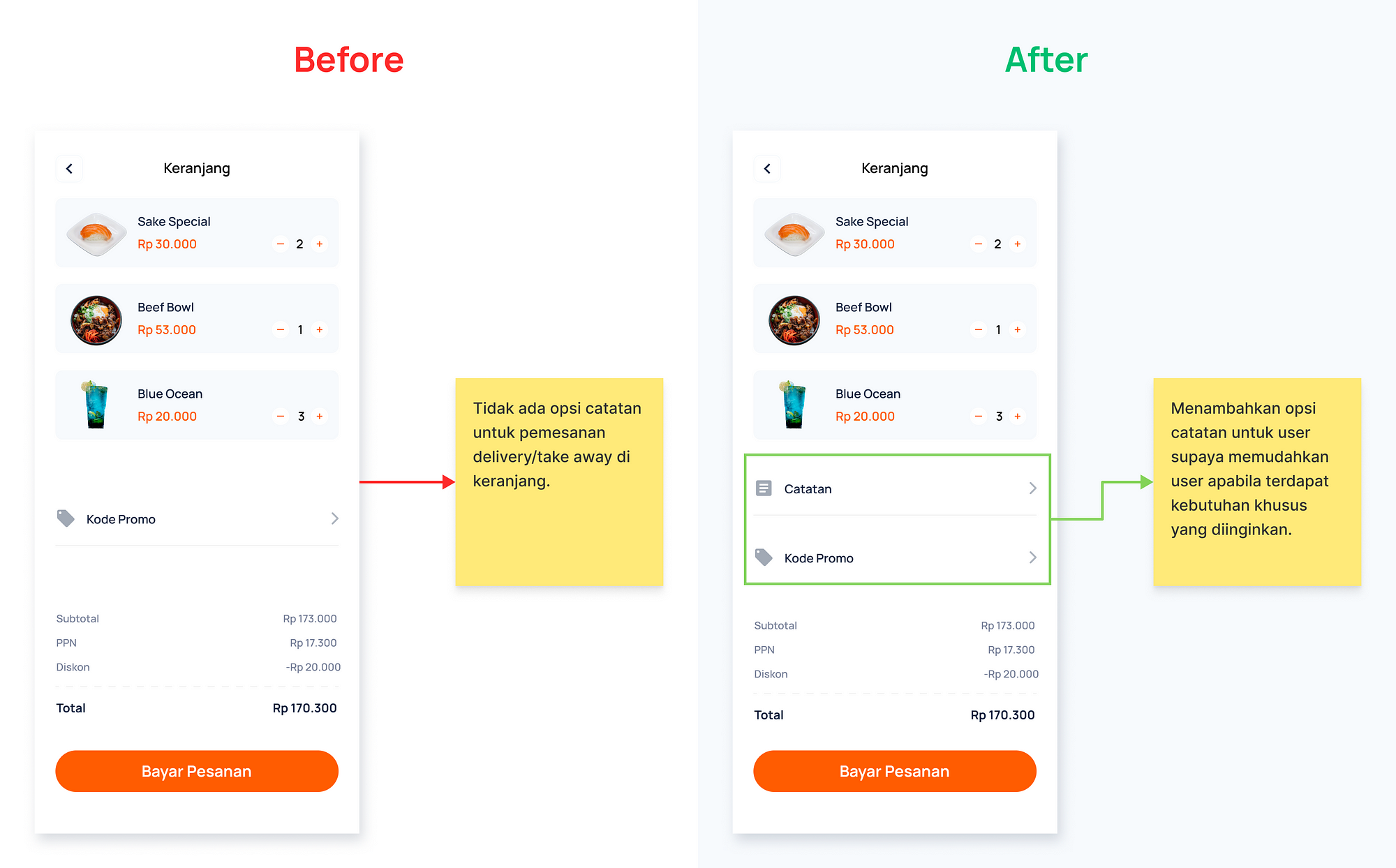
Cart
Pain point:
Doesn't have a note option for delivery / take away orders in the cart.
Design Solution:
Added a note option for the user to make it easier for the user if there are special needs that are desired.
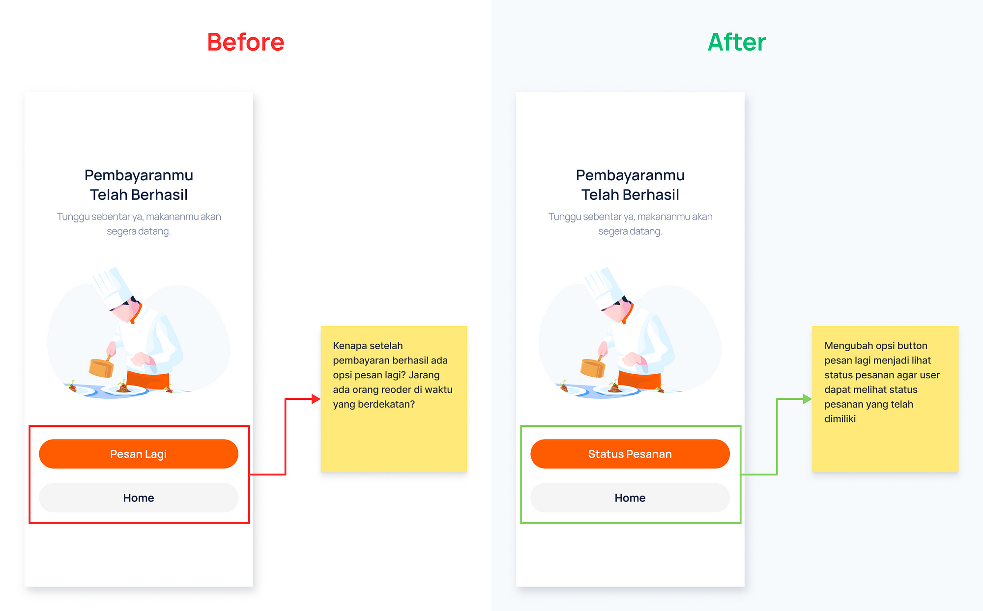
Successful Payment
Pain point:
hardly anyone is reordering anytime soon.
Design solution:
Changed the message button option again to view order status so that users can see the status of orders they already have
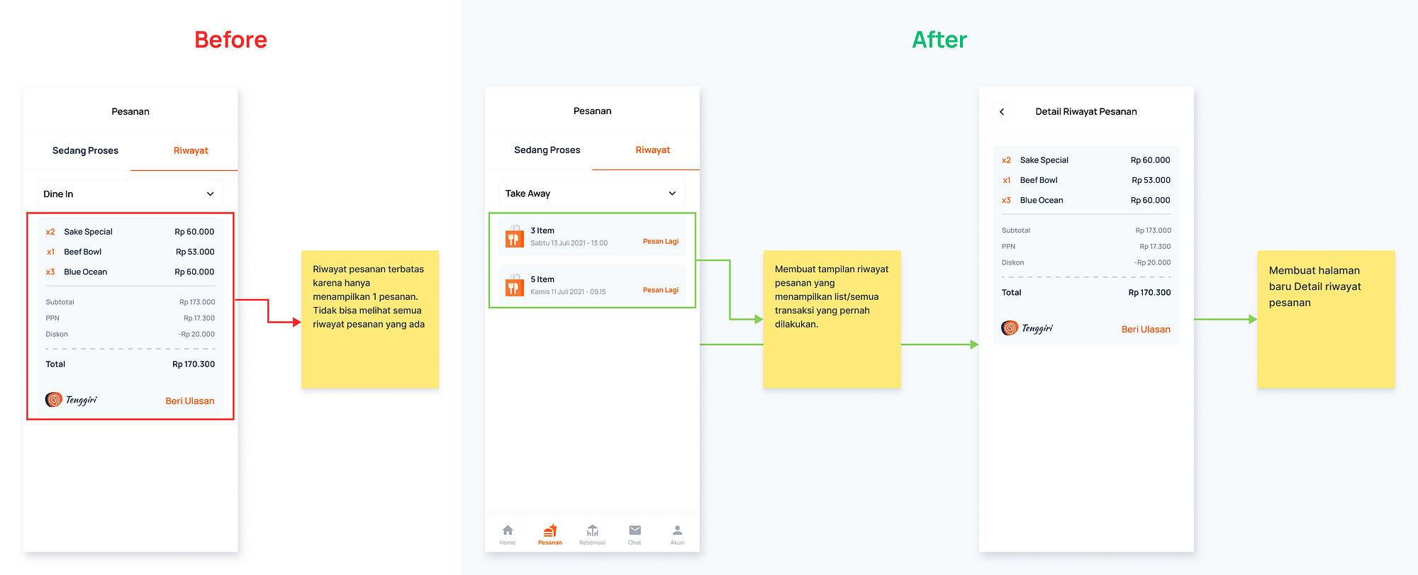
Order History
Pain point:
Order history is limited as it only shows 1 order. Can't see all existing order history
Design solution:
Created an order history view that displays all transactions that have been made.
Redesign Feedback:
The redesign that I did got good feedback from the users. the user feels the new design is obvious in providing information and remains easy to use.
Conclusion
From this case study, I have learned a lot about the design thinking process in solving various problems and how to solve these problems.
Here are the things that I can highlight:
- I have to learn to be more careful based on the existing data and I'm still here using my assumptions in several aspects. Therefore, if I have more time I want to do another user research and A/B Testing.
- In this case study, I continue to make improvements and iteration for future design development.
Disclaimer
Illustration on apps: Envato
The image on apps: Pexels & Unsplash
Thanks for reading my case study! If you can provide criticism or suggestions about our case studies, we will be very grateful. You can reach me on LinkedIn .
Design A App For Restaurant Table Booking
Source: https://uxplanet.org/case-study-tenggiri-app-order-food-and-reservation-restaurant-app-f8069860142a
Posted by: freundyouten.blogspot.com
0 Response to "Design A App For Restaurant Table Booking"
Post a Comment